Bank of Marin website

The Overview

This website was part of a successful rebranding for the bank. While a new look was developed for the site, the architecture was streamlined, and the pages were designed for better usability while staying flexible enough to accommodate frequently updated content.

The Details

Client : Bank of Marin
Tools : OmniGraffle, Photoshop, Illustrator, Word
Role : User Experience Designer

Approach

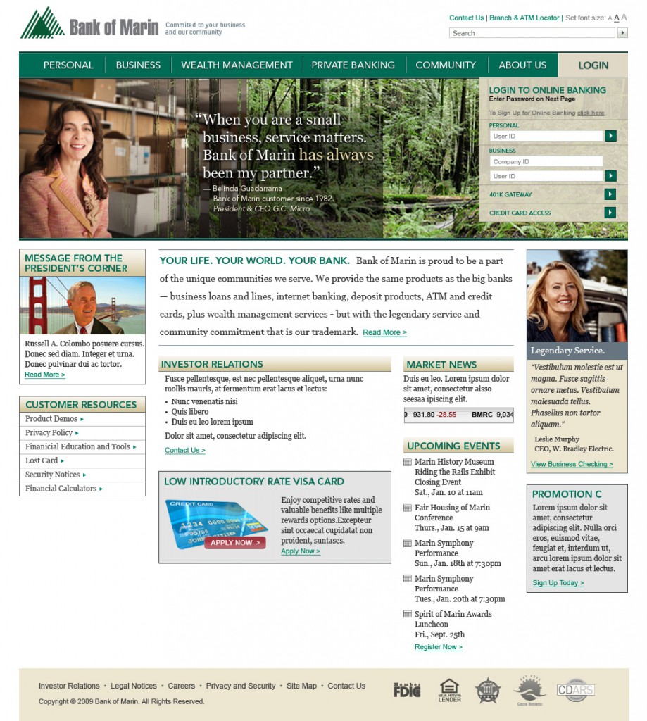
The client was looking for an approachable and representative brand that clearly showed its service offerings in business as well as personal banking. The logistics of the banks’s online transactions were formatted by a third party service, but we knew we needed to put access to them, prominently in the new site. We had useful input from the client about their business goals and from some loyal customers the client connected us with. Our personas were actual customers that were deemed most representative.
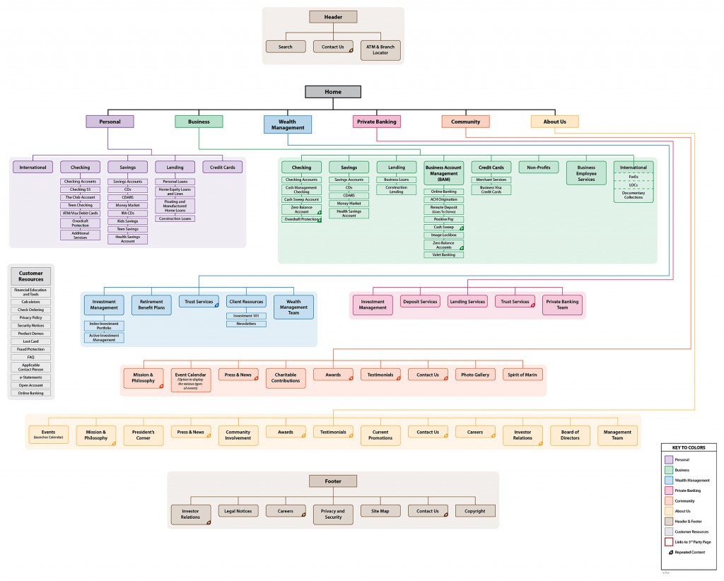
Sitemap

Our team started out with a whiteboard session aimed at nailing down the new site architecture. We took apart the existing site section by section, page by page and reframed it to align with new goals of the client. We identified gaps and roughed out a content strategy for the rebrand.

Whiteboarding Site Structure

After interviewing employees and customers, we had a whiteboarding session and worked out a site structure to serve the needs of the key personas.

Formalized Structure

The whiteboard sketch was refined to create a formal sitemap that we used to get client buy-in and later to identify user flows through the site.

Visual Design

The project was as much a rebranding as anything else. So, the agency had internal and external resources pitch a number of representative looks to be culled and refined. Concurrent to my wireframe work, I contributed visual designs for the creative director to assess. It was an unusual project workflow, but represented the marketing agency’s approach to creative digital projects.

After discussions with the project lead and client, I did three visual design treatments to be considered for client presentation. In this direction, I wanted to show that the bank was part of its community by including a headshot and pull quote along with photography of the area. Colors and fonts were chosen to be professional and approachable.

Wireframing

For this project, the wireframes are minimal and focused on content placement and information hierarchy. There was conceptual ambiguity when they were started, so a textual approach was easier to adjust as the project matured.

Homepage

A secure content management system allowed the client to update content on their own. They were easily able to change side column modules to stay fresh and relevant. There was ample space designated for promotions in anticipation of ongoing and seasonal offers.

Community Page

The CMS allowed us to provide the client with a robust community section of their site. It then stayed fresher with more content, but requiring less work. The client was able to have a photo gallery, videos and testimonials. Impressive amateur photography was solicited from the community in exchange for recognition.

Final Design

Here is the final visual design that was developed for the website. The creative director pulled elements from many different designer concepts while adding his own flair.

Development

The was a waterfall project and development was largely done by a third party. Final designs were handed off to developers for templating into the chosen CMS. We also conducted photoshoots of real customers and used their words in the hero images.

Delivery

The client loved the new branding and site organization and felt it nailed the new direction they wanted to go. They took the site and ran with it.