Mindjet Website

The Overview

This mind mapping is a way to give structure to organic note taking. This mind mapping software company needed a refreshed website to market their products. With a flagship product and several add-ons, the approach required plentiful cross- and up-selling spaces.

The Details

Client : Mindjet
Tools : OmniGraffle, Photoshop, Word
Role : User Experience Designer and Production Lead

Approach

A big component of this marketing site redesign was a content overhaul. UX really had a limited role in the project. I knew I should spend my time on making sure the right things were on the right pages.

Discovery

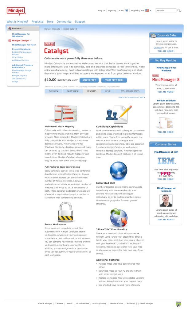
Prior to our kick-off meeting with the client, I dove into their website and got trials of their software. I wasn’t familiar with mind mapping at the time, so I wanted to understand the methodology to better understand the customers who used it.

To save resources, we simply used the client’s description of their customer to create rough personas for internal use.
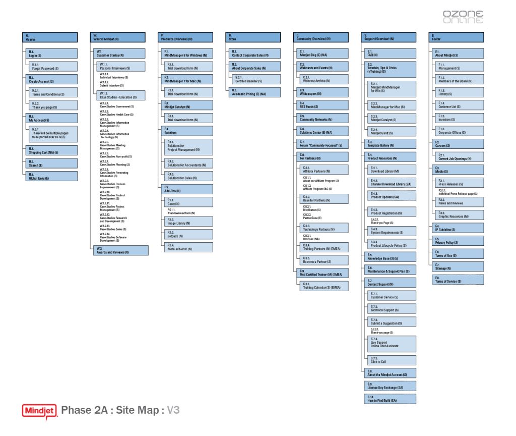
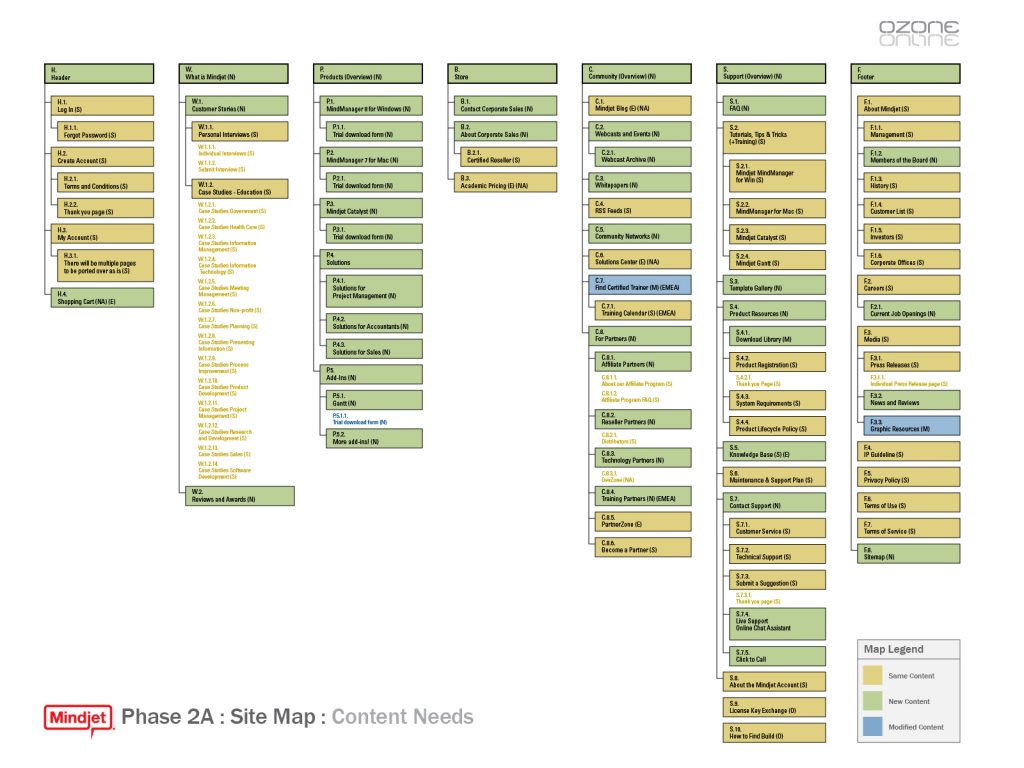
Sitemap

Site Structure

As there was an existing website, the new sitemap had only a few tweaks.

Content Gaps

The redesign included a content inventory and gap analysis. We wanted to help the client visualize the content gaps in their site. So I repurposed our sitemap to show the pages that needed new or repurposed content.

Wireframe Gaps

The content gap sitemap was well received, so I used the same visualization to show remaining work for a milestone meeting.

Wireframing

Product Section Hub

The visual hierarchy reflects the relative importance of the product in their software line. Links to purchase and download a trial have been put adjacent to each product description to provide an entry point for sales and lead capture. A link has been included on the page for capturing corporate sales.

Individual Product Page Overview

For the keystone product, there was extensive product information to present. We avoided a long page with a tabbed approach. We provided information for users with different needs by loading the page with content that was dependent on the originating link.

Individual Product Page Features

Analytics told us that visitors spent ample time reading the product details, so were comfortable in dedicating a tab on the product page to features. We also included links to purchase and download a trial at the top of all product pages to give visitors a clearly defined path of action.

Visual Design

Our creative team quickly turned around a light, content-driven design.

Development

This was very waterfall. Assets and designs were delivered to the client for internal development.

Delivery

The project ended on time and budget. The client was satisfied with the design. Though there were two additional re-brands not long after our work was done. So ultimately I got the impression that we could have made a greater impact than we did.