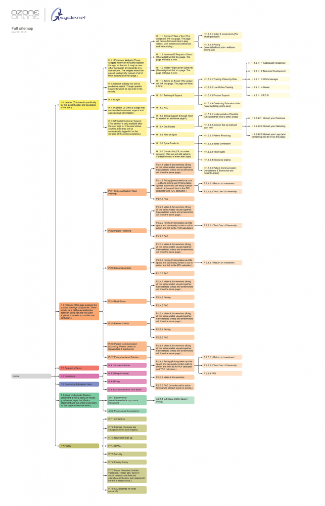
Sycle website

The Overview

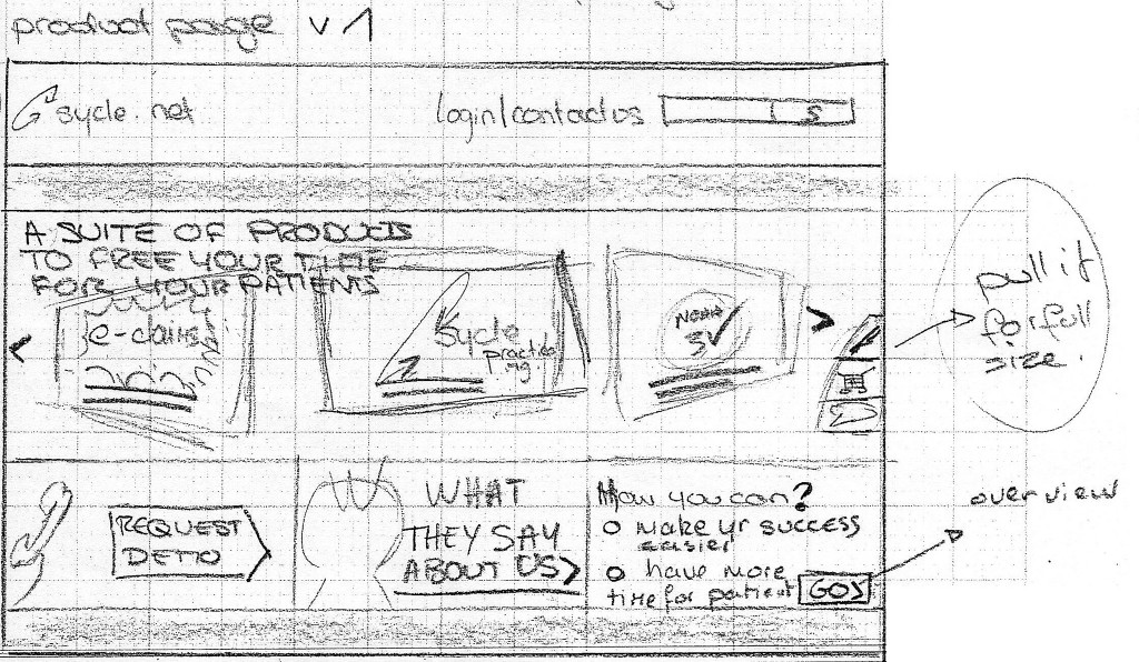
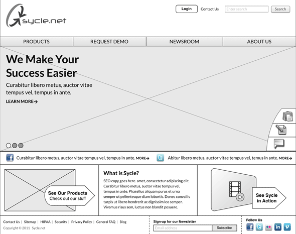
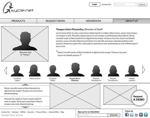
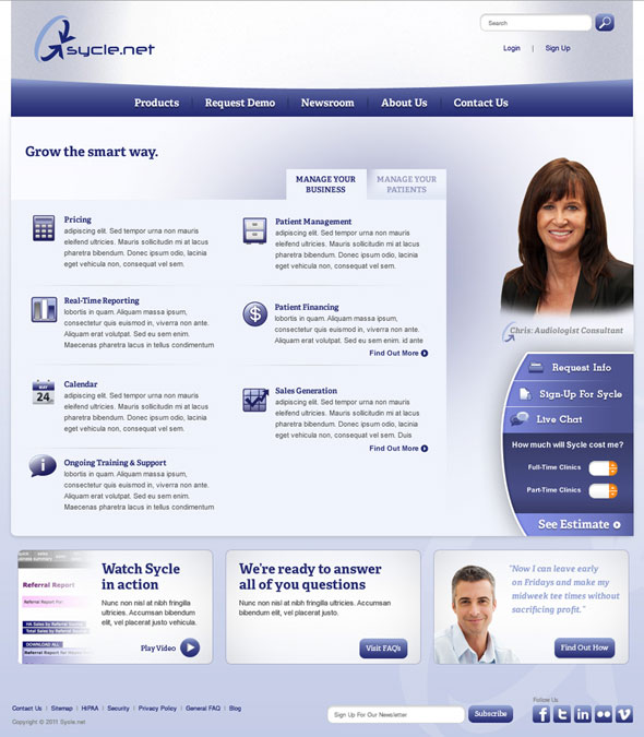
Sycle.net has a leading SaaS product solution for audiology clinic management. Their website was outdated and failed to effectively market their product line. In developing a new website, we focused on explaining their product line, their attention to personal service, and most of all—capturing sales leads.

The Details

Client : Sycle.net
Tools : OmniGraffle, OmniOutliner, Illustrator, Photoshop, Excel
Role : Senior User Experience Designer

Inception

I was pulled into this project after it had left the station, so to speak. The client had a smart, impassioned team who worked closely with their customers. The client was having concerns about organizing their ideas in a way that fit in their vision.

Approach

I wanted to come in and bring value by capturing client ideas and adding to them where I could. I also felt I needed to add structure and formality to deliverables so they would be embraced and executed. That being the case, I brought in as much design process as I did design thinking.

Sitemap

Working with the product management team, a comprehensive site structure came together quickly. The whole site is shown in this sitemap.

Pages are individually numbered for easy reference. And each ‘leg’ of the site structure has a different color to help differentiate it and quickly communicate size to the client.

Ideation

The product manager and I had several impromptu, informal ideation sessions where we both drew out our vision for the website. It was a passionate way to capture what we thought the site could offer to customers.

Sketching

Starting with my notes from the client about the business goals and audience, we went to graph paper and sketch out dozens of idea iterations. The product manager and I were able to hone in on solutions that captured the best of both our visions. The process helped bring both our enthusiasm through the project while staying respectful of our talents.

Wireframing

I went into wireframing with pages of sketches to inform my design. It freed me to quickly compose layouts that I knew would resonate with the client. I felt I may have gotten caught up in the process, so I revisited my work to holistically ensure the customer was at the center.

Product Listing

This is the eventual evolution of the above sketch. You can see elements that have remained, and the addition of screen real estate to explain individual products with copy and video examples.

Homepage

The homepage had a very large image area that was used to introduce the sales and support staff. Lead capture was a goal of the website, so an expandable widget of links was used throughout the site.

Staff

A similar UI is given to introduce the people that customers deal with on the phone as they do business with Sycle. Large portrait shots are accompanied by copy written in a friendly, personal tone.

Supplemental Product

This layout shows a software add-on to their main product. Ample space was dedicated to explanatory copy. The persistent lead capture elements are fully expanded to take advantage of this page to upsell to customers.

Visual Design

All the elements pulled together for a campaign landing page in this final visual design.

Development

This was a waterfall project and the client used their own developers to execute the design. While they didn’t start dev until the client gave final approval, there was always an engineer present in meetings. We also made ourselves available to tackle and questions or issues.

Delivery

The client really loved the final website. They put a great deal of themselves into the website and it showed. Their customers praised their new site through emails, calls and conferences.